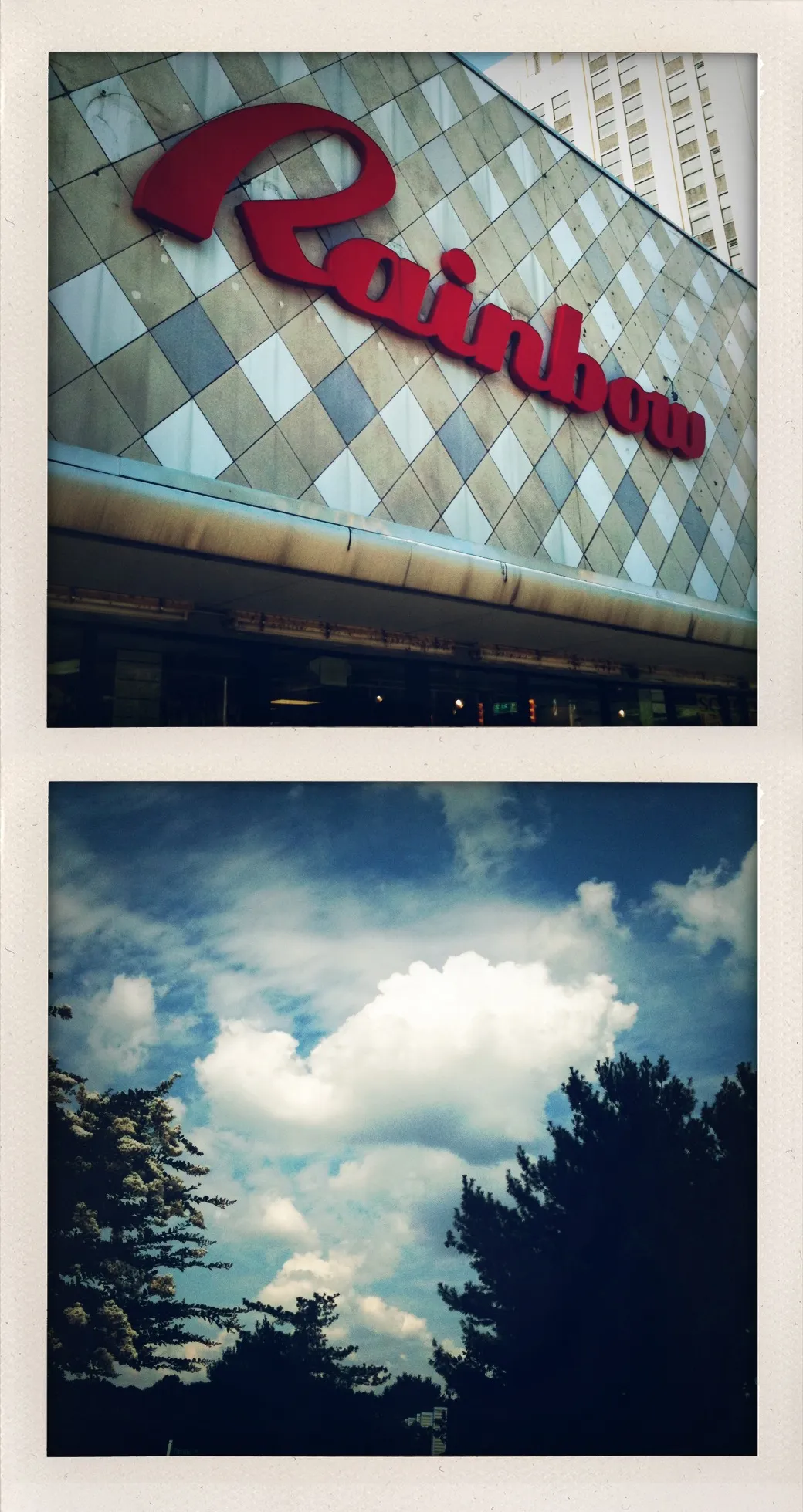
Dip|Tychs Storytelling and Altered Contexts Through Juxtaposition

Cloud Cover

This diptych juxtaposes a commercial “Rainbow” sign with a cloudy sky, revealing how branding often overlays and reframes our experience of the natural world. The sequence reverses expectation, presenting illusion before atmosphere.


Cloud Cover presents a diptych that quietly inverts both natural logic and visual expectation. The work features two stacked photographic images: the upper frame depicts a storefront sign spelling “Rainbow” in red script, affixed to a diagonally tilted building facade. The lower frame offers a wide sky filled with cumulus clouds, framed at the bottom by dark, silhouetted treetops.

The visual juxtaposition is subtle but purposeful. In the upper image, the commercial sign replaces the phenomenon it names. “Rainbow” appears not in the sky but on a wall—cheerful and glossy, yet slightly askew. The surrounding architecture reveals wear: rusted fixtures, aging tiles, and the encroachment of a modernist high-rise at the edge of the frame. The sign becomes a kind of corporate sky—bright, declarative, and suspended above a world that shows its seams.

The lower image restores the literal sky. Clouds drift across a deep, shifting blue; the ground is implied only by the silhouettes of trees, placing the viewer in a contemplative upward gaze. Crucially, there is no rainbow. The atmospheric elements are present—sunlight, water vapor, shadow—but the expected spectacle is absent. In this reversal, the sign functions as a stand-in for the natural, inserted before the viewer can encounter the real.

The title Cloud Cover operates on multiple levels. Meteorologically, it refers to the percentage of sky obscured by clouds. Conceptually, it also suggests concealment or overlay—an artificial rainbow covering what lies beneath. The composition literalizes this idea: the sign rests above the clouds, both physically in the diptych and metaphorically in the viewer’s interpretation. What is promised by the sign does not appear in the sky; instead, the promise itself becomes a barrier.

The formal qualities of the work deepen its meaning. The vertical stacking encourages a reading from illusion to atmosphere, from branding to environment. The framing and coloration recall instant film aesthetics, infusing both panels with a nostalgic softness. This familiarity invites trust, even as the images subvert the expectations that aesthetic might create. The emotional warmth of analog photography contrasts with the conceptual chill of manipulated perception.

Cloud Cover reflects broader cultural tendencies to replace natural phenomena with commercial signifiers. The rainbow, once a fleeting and awe-inspiring event, is now just as likely to be encountered as a marketing device. In the context of consumer culture, spectacle is often prepackaged and pre-positioned—installed in advance of the conditions that might justify it. The diptych does not critique this directly, but instead reveals the quiet dissonance it creates. When the rainbow arrives before the storm, it signals not clarity, but control.

By presenting the promise above the reality, the work encourages viewers to consider how much of what they perceive is constructed in advance. It questions not only what we see, but what we expect to see—and who benefits from shaping those expectations.

Cloud Cover leaves space for reflection. In a world increasingly mediated by signage, branding, and curated imagery, this diptych restores a sense of distance and ambiguity. The clouds remain mute. The sky withholds its rainbow. And in that gap between promise and presence, something honest emerges: a glimpse of weather unfiltered.

Essay written: May 2025