Dip|Tychs Storytelling and Altered Contexts Through Juxtaposition

Wisconsin

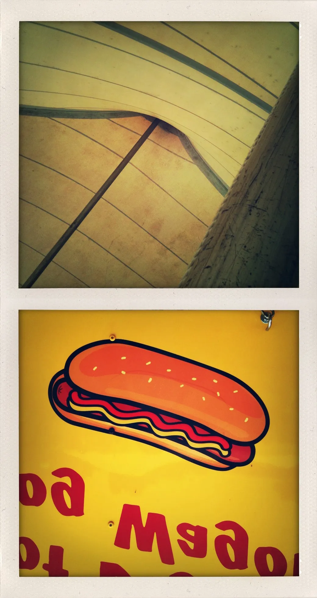
This diptych contrasts structural abstraction with commercial iconography to explore how regional identity is shaped and commodified. Referencing Wisconsin’s circus history and German-American food culture, the work uses color and composition to reflect on memory, performance, and the aesthetics of nostalgia. By pairing a weathered canopy with an upside-down hot dog sign, the image deconstructs how place is remembered—not through lived experience, but through symbols, signage, and spectacle.


In this diptych, the visual elements of regional Americana are broken down into two distinct but thematically linked halves. The upper panel presents the interior of a large tent or canopy, its structural ribs converging into an off-center axis. Lines arc gently across the surface, suggesting both containment and openness. The soft yellow tones, weather-stained fabric, and muted lighting evoke a sense of provisional architecture—functional, worn, and familiar. In contrast, the lower panel bursts with saturated commercial design: a brightly illustrated hot dog rendered in flat, cartoon-like style, suspended against a vibrant yellow background. The sign is upside down, rendering its red text partially illegible and transforming language into abstract shape.

The color yellow unites the two images, yet its function shifts dramatically between frames. In the tent, yellow is naturalized, dulled by light and time. It becomes part of the material world—sun-bleached canvas, aged wood, dust in the folds of a fairground structure. Below, yellow is synthetic and assertive, a visual shout that commands attention in the context of sales, signage, and branding. The tonal contrast reflects a broader conceptual divide: one panel offers quiet observation, the other performs visual consumption.

The juxtaposition invites reflection on Wisconsin’s cultural iconography. The upper image alludes to the traveling circus, a nod to Baraboo, Wisconsin, the historic home of the Ringling Brothers. The skeletal tent overhead becomes a reference to spectacle, but viewed from backstage—a reminder of the labor and logistics behind illusion. Meanwhile, the lower image captures the abstraction of regional food culture. Bratwurst, rooted in the state’s strong German heritage, is here simplified and flattened into a corporate emblem. What once was handmade and context-specific becomes universally legible and instantly marketable.

Inverting the hot dog sign serves as both a literal and conceptual device. Visually, it destabilizes reading and defers immediate comprehension. Conceptually, it mirrors the disorientation that can arise when place-based culture is reduced to brand identity. Typography becomes decoration, heritage becomes packaging. The humor embedded in the inversion also echoes the absurdist tradition of carnival and sideshow—a visual pun that folds history into parody.

The use of a faux-Polaroid frame, along with the image’s soft contrast and warm tones, reinforces the aesthetic of nostalgia. Yet rather than indulge in sentimentality, the work positions nostalgia as a construct—something designed, selected, and filtered. This is not simply a memory of place, but a commentary on how places are remembered, how their meanings are mediated through commerce, signage, and repetition.

Compositionally, the diptych is rigorous. The top image draws the eye inward along lines of perspective, while the bottom image repels the gaze with its flat, forward thrust. This tension between depth and surface, between the dimensional and the graphic, forms the backbone of the work’s conceptual framework. It stages a confrontation between lived environment and mediated experience.

Ultimately, Wisconsin asks what happens when the structures that once framed communal experience—the tent, the fair, the family-run brat stand—are replaced or overshadowed by their symbolic proxies. In its quiet abstraction and pop-art boldness, the diptych highlights the friction between authenticity and representation. It offers a subtle but pointed meditation on how regional identity is performed, flattened, and inverted in the cultural imagination.

Whether viewed as homage or critique, the work invites viewers to reconsider the spaces and symbols they associate with place—not as fixed or nostalgic, but as constructed, shifting, and always open to reinterpretation.

Essay written: May 2025